Flex 布局是轴线布局,只能指定“项目”针对轴线的位置,可以看作是一维布局。
Grid 布局则是将容器划分成“行”和“列”,产生单元格,然后指定"项目所在"的单元格,可以看作是二维布局。Grid 布局远比 Flex 布局强大。
一般情况下,在处理某一行的元素的布局时使用flex布局;在处理多行的元素布局时使用grid布局。
grid解决

如果使用flex要实现类似这样的布局,是很麻烦的
需要去算盒子的宽度和中间的间隔
body{
    margin: 0;
}
.item{
    width: 135px;
    height: 40px;
    background-color: #247ad0;
}
.flex {
    width: 600px;
    background-color: #f0eeee;
    display: flex;
    flex-wrap: wrap;
}
.flex .item{
    margin-bottom: 20px;
}
.flex .item:nth-child(4n+1),
.flex .item:nth-child(4n+2),
.flex .item:nth-child(4n+3){
    margin-right: auto;
}
如果不用flex会更复杂,但是也是可以实现的
注意空白折叠!
.item{
    display: inline-block;
    width: 300px;
    height: 40px;
    background: #2be274;
    margin-bottom: 20px;
}
.item:nth-child(4n+1),.item:nth-child(4n+2),.item:nth-child(4n+3){
    margin-right: calc((100% - 1200px) / 3); /*如果考虑空白折叠,还要再-5px*/
}
但是,如果使用grid,将会超级简单
.grid {
    display: grid;
    grid-template-columns: repeat(4, 1fr);
    row-gap: 20px;
    column-gap: 20px;
}

.grid .item {
    height: 40px;
    background: #2be274;
}
以上就是grid最常用的属性了
grid容器属性
grid-template-columns
划分列数
固定宽度
grid-template-columns: 40px 40px;
百分比
grid-template-columns: 40% 60%;
比例
grid-template-columns: 1fr 2fr;
重复
grid-template-columns: repeat(5, 1fr); /*5列,每列等宽*/
自动计算列
grid-template-columns: repeat(auto-fill, 600px); /*每列固定600px,自动算多少列*/
grid-template-columns: repeat(auto-fit, 600px); /*每列固定600px,自动算多少列*/
auto
grid-template-columns: 100px auto 100px;
grid-template-rows
划分行数
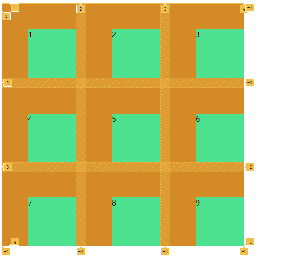
行列间距
grid-template-columns: repeat(3,1fr);
/*grid-template-rows: repeat(3,1fr);*/
row-gap: 20px;
column-gap: 20px;
gap是row-gap和column-gap是简写
容器对齐方式
justify-content
水平对齐方式
justify-content: center;
垂直对齐方式
align-content: center;
place-content
是align-content属性和justify-content属性的合并简写形式。
place-content: end end;
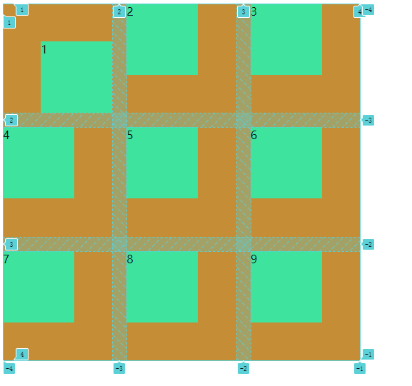
单元格对齐方式
justify-items
align-items
place-items
是align-items属性和justify-items属性的合并简写形式。
justify-items: end;
align-items: end;
项目内单元格对齐方式
用法和justify-items类似,但是是在项目属性上写的
<div class="item" style="place-self: end end">1</div>
grid项目属性
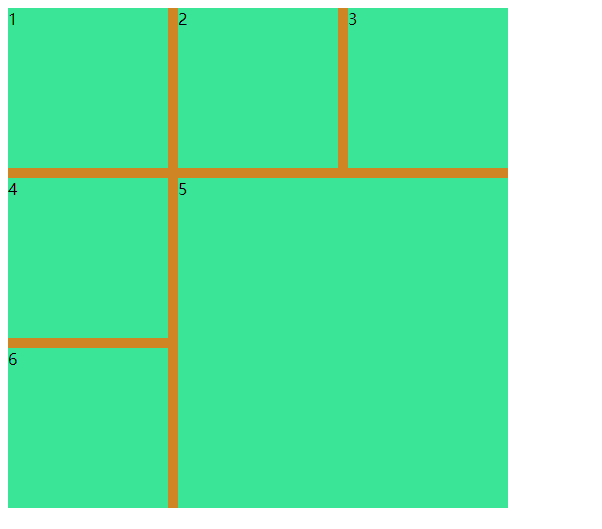
合并单元格
.item-8{
    grid-column-start: 2;
    grid-column-end: 4;
}
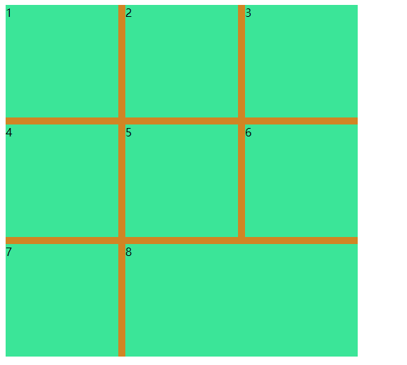
.item-5{
  grid-column-start: 2;
  grid-column-end: 4;
  grid-row-start: 2;
  grid-row-end: 4;
}
可简写为
grid-row: 2/4;
grid-column: 2/4;