变换
使用变换之后,这个原来的位置还在文档流里
只作用与块盒和行内块
可以多个属性共存
平移 translate
translate(x, y);
旋转 rotate
deg是角度,顺时针方向
rotate(60deg);
缩放 scale
scale(1.2);
使用缩放,可以破除浏览器12px最小字体大小的限制
锚点
主要这对于缩放和旋转
transform-origin: left top;
过渡
transition属性包括以下几个子属性:
transition-property:指定要过渡的CSS属性名称,可以使用通配符all表示所有属性都要过渡。transition-duration:指定过渡的持续时间,单位可以是秒(s)或毫秒(ms)。transition-timing-function:指定过渡的时间函数,用于控制过渡的速度曲线,常见的值有ease、linear、ease-in、ease-out、ease-in-out等。transition-delay:指定过渡的延迟时间,即过渡开始前等待的时间,单位可以是秒(s)或毫秒(ms)。
 .line{
    display: inline-block;
    transition: all 1s;
    transform-origin: right top;
}
.line:hover{
    transform: scale(1.2);
}
动画
创建动画序列,需要使用 animation 属性或其子属性,该属性允许配置动画时间、时长以及其他动画细节,但该属性不能配置动画的实际表现,动画的实际表现是由 @keyframes 规则实现
| 属性 | 描述 |
|---|---|
animation-name |
指定由 @keyframes 描述的关键帧名称 |
animation-duration |
设置动画一个周期的时长 |
animation-delay |
设置延时,即从元素加载完成之后到动画序列开始执行的这段时间 |
animation-direction |
设置动画在每次运行完后是反向运行还是重新回到开始位置重复运行 |
animation-iteration-count |
设置动画重复次数, 可以指定 infinite 无限次重复动画 |
animation-play-state |
允许暂停和恢复动画 |
animation-timing-function |
设置动画速度, 即通过建立加速度曲线,设置动画在关键帧之间是如何变化 |
animation-fill-mode |
规定元素在不播放动画时的样式(在开始前、结束后,或两者同时) |
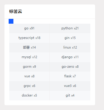
实现一下我博客里面标签滚动的小方块吧
<div class="tags">
    <div class="box">

    </div>
</div>
.tags {
    width: 400px;
    height: 400px;
    background: rosybrown;
    position: relative;
}

.box {
    position: absolute;
    width: 20px;
    height: 20px;
    background: blue;
    animation-name: move_box;
    animation-duration: 5s;  /*执行一次动画的时长*/
    animation-iteration-count: infinite; /*循环播放*/
}

 .tags:hover .box{
    animation-play-state: paused;
}

@keyframes move_box {
    0% {
        left: 0;
        top: 0;
    }

    25% {
        left: calc(100% - 20px);
        top: 0;
    }

    50% {
        left: calc(100% - 20px);
        top: calc(100% - 20px);
    }

    75% {
        left: 0;
        top: calc(100% - 20px);
    }
    100% {
        left: 0;
        top: 0;
    }
}